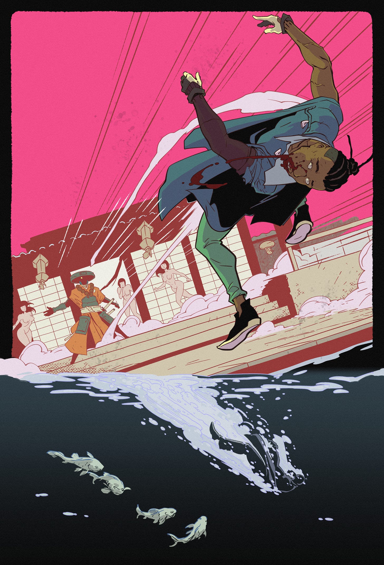
COMIC: See 'Tower of Death' IN COLOR
I colored a few pages of 'Tower of Death', and here they are. Stay tuned for a few recommendations at the bottom, as well.
Hey fellas!
Back when I was drawing Tower of Death, I had a mighty stupid idea to color it.
I can’t recall what the thinking was, but I presume I was going to offer a black and white digital copy to drive subscriptions to Ronin Digital Express, and offer a deluxe, colored version in a paid tier, or something.
In any case, my artistic approach to Tower of Death was a little different than what I’d done with Ronin previously. The art was a little more abstract, focused on shapes and silhouettes and motion, to better fit the black & white manga style.
That means by the time I got to coloring, I assumed it’d be easy-pease. I colored over 100 pages of the webcomic, after all.
Didn’t work out that way, though. It was quite a bit more challenging, and I got stuck on it for a good while.
I ultimately decided to can the effort. I wanted get cooking on Fistful of Yen and other projects, and felt this was becoming a distraction.
But I did manage to stamp out a few pages that ended up looking pretty good!
I’m presenting them to you here for your enjoyment, and as a reminder to stick around rent*space for the occasional fun little extra no one else gets to see.
Warning that some contents are NSFW!
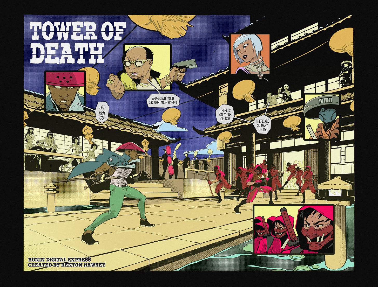
The double-page opener. This is definitely the best-looking of the bunch, and it captures the vibe of what I imagined the rest looking like.
I’m a little iffy on this one. There are just so many colors and textures that I think it loses focus. This is about when I started feeling like maybe this wasn’t such a bright idea.
Love this one for the most part. 10/10, no complaints.
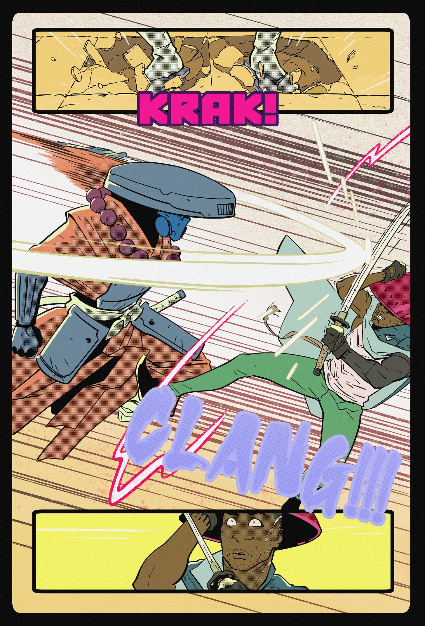
This turned out okay as well, but I think the colors somewhat dampen the motion the black & white version has. Color just separates the shapes too much. In the original black & white, you feel a little more whipped up, like you’re rattling around in consciousness with the ronin (as he gets his face smashed in).
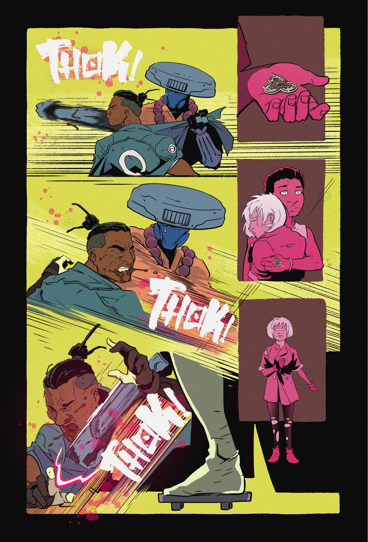
Finally, this one is pretty good. I had to get a handful of tips on it from some fellow artistes to push it over the line, and right about here is where I decided to call it quits.
Even though this page was a high point, the remaining pages are a lot more abstract and felt like they would have been a lot more difficult to color. To hell with that, right?
That’s all for today. If you didn’t get a chance to read Tower of Death, but are now intrigued, you can pick up a digital copy on Gumroad:
Shoutouts:
The great Hab Oh graced Tower of Death with a glowing review over on TikTok. If you’re on the fence about a purchase, let him sell you here. Give him a heart while you’re there and a follow on Twitter.
I got an alt-cover on the stands TODAY for my friend Milton Lawson’s Orson Welles: Warrior of the Worlds #1 from Scout Comics. Milton has been through a lot (including legal battles) to bring this project to life, and I was happy to play a small role in it. Learn how to get it from his Substack post on the subject.
I met a cool artist-musician named Thröa recently. They make really cool pixel art merch that you can buy here. Links to socials are on-site as well; you’re smart, you’ll figure it out.
Until next time. Be good!


