STEAL IT: How I made this Metal Gear Solid 3 fan art
I tested out True Grit's CSP suite. Here's what I made, how I made it, and whether or not I think you should give them a try.
Hey fellas!
Buckle in for a longer one, though to make things more convenient for the non-artists who have no curiosity about the craft stuff, I’ll put the art up top and the process downstream.
Big reminder folks that if you like this post, hit the ❤️ up there to let me know, or leave me a 💬 down below, I’d love to hear from you.
The reason for the season is the True Grit brush pack, a yuge combination of brushes, shaders, paper textures, and tones, plus the KraftTone color system, which allows one to make the colors like your grandaddy (or possibly a small child) do by mixing different densities of CMYK stippling together so that from far away it looks like a flat color, and up close it looks like a rad retro comic.
Though I’ve often been given compliments on my coloring style for Ronin Digital Express, the sad sack truth of it is that I struggled mightily throughout the comic’s development with the colors in particular, and have been on the search for something that is both easier to navigate and a match for my Spaghetti Western sensibilities.
Enter the True Grit stuff, which I encountered via aggressive Instagram marketing sometime last year only to find out that the tools were not available for Clip Studio Paint (CSP), my comic creator program of choice.
Lo and behold, plenty in the comments section bemoaned the lack of CSP availability, and so the True Grit elves busied themselves with rebuilding their system from the ground up to accommodate we CSP whiners.
Once I got my hands on them, I had to test them out.
And what better subject than the classic Hideo Kojima joint Metal Gear Solid 3: Snake Eater, both a large influence on me and the kind of 60s spy-fi project that could do for a retro comic makeover.
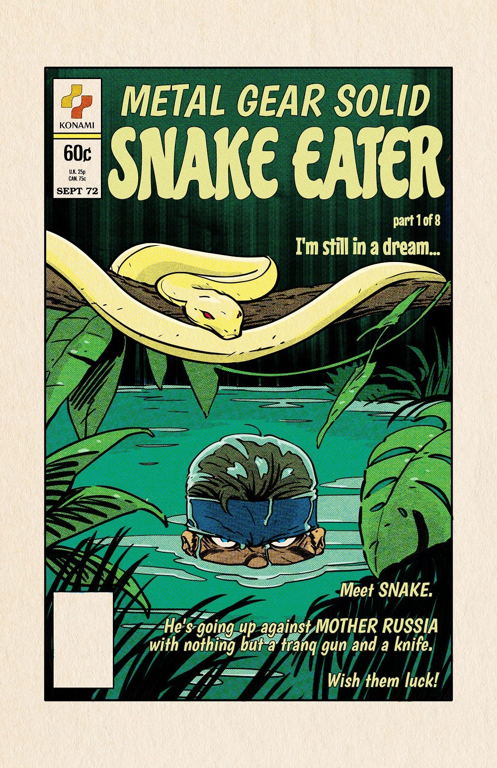
Metal Gear Solid 3: Snake Eater, the comic that never was
Here’s cover #1 of a hypothetical 8-part series adapting the plot of Snake Eater. Eight parts probably wouldn’t be enough, but I had to draw the line somewhere.
I pulled / traced the dress details from an old comic cover and the classic Konami (spits in contempt) logo, and for you lettering nerds, I used various free 60s-style fonts including Gnoulane RG, Chicle, and Boogaloo.
Up next is a sample page from probably my favorite part of the game, the Krasnogorje mountain pass sequence right before you hit Groznyj Grad and the game’s third act.
Not much to say here except that the Dragunov and the RPG are your friends in this sequence, so I wanted to put them on Snake.
Up next …
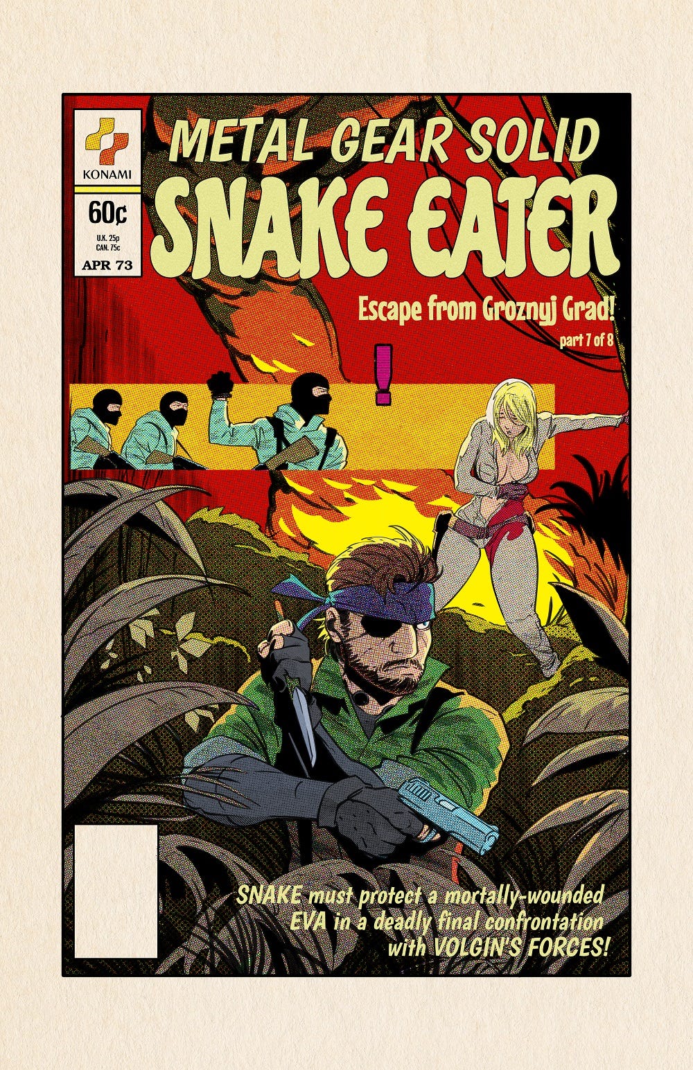
Another cover, this one capturing the “protect Eva” sequence, with the issue probably ending with a cliffhanger of Snake finally confronting The Boss.
Then in the final hypothetical issue, the battle with The Boss and the fallout afterwards.
Lastly!
I’m a pinup man, so I had to squeeze in an Eva. If you’re a paid subscriber, you’re getting the NSFW version next week, with some vintage Playboy Magazine cover dress added.
You’re welcome in advance, and if you’re not a paying subscriber, here, become one.
So how did I do it?
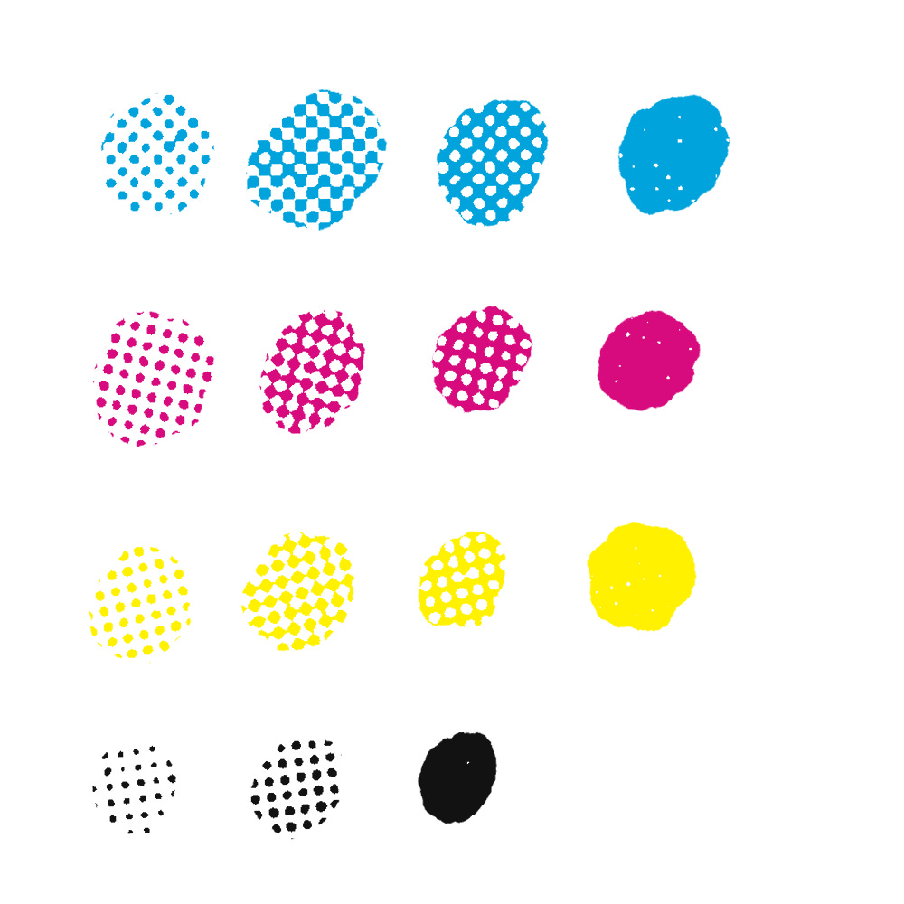
The KraftTone system works like so.
You’re given these:
That’s C2, C3, C4, and C, and then on the next line, M2, M3, M4, and M, and so on and so forth.
There are a couple of other texture variations, but that’s about it.
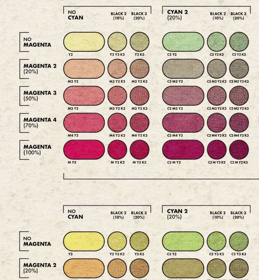
You’re also given a lot of supporting materials that explain how to use each thing. Helpful video walkthroughs, as well as things like the utterly indispensable color guide, which explains how you can mix basic bitch CMYK into well over 300 colors:
This is just part of the massive guide, which covers just about every color you’d need.
If you look down at the letter / number combos beneath each color, that’s what tells you what to combine to get that color.
Now, to actually combine the colors in CSP:
You have to do exactly this, or your colors are going to look all fucked up.
Create a separate layer for each color (I organized mine into a folder, you don’t have to).
Set each layer to MULTIPLY.
Make sure you ONLY use C on the C layer, and so on and so forth.
I have a MISC layer there for grays and other colors I wanted to use that aren’t in the KraftTone color system. For something like Snake’s forearms and gloves, I just did a flat gunmetal gray and then covered it with a black stippling texture. That’s just my little creative spin on the ball, you do you.
Anyway, here’s how it all comes together:
I didn’t color layer by layer like that, I did each individual item from back to front, but this gives you an idea of the layer breakdown.
Last note, the paper texture you see there also comes with the True Grit suite. There are several templates for different aged paper styles to help you nail that retro vibe.
I found the textures to be slightly too strong, so I dropped the transparency to 50% or so. All depends on how moldy you want the paper to be.
Was it worth it?
The KraftTone color system was a really fun way to approach colors, and it definitely made me a better colorist in the end. I’ll definitely continue to use it, though mostly for covers and prints that need a retro spin.
It’s definitely a time-consuming process, and there are easier ways to add a bit of retro flavor to your colors (like coloring flats style and using colored stippling and textures for highlights and shading).
Now, the moment of truth. If you liked what you saw here, should you buy it?
I would highly recommend picking up True Grit’s CSP suite, even if you’re not interested in the KraftTone color system. It comes with TONS of inkers, brushes, and textures, many of which I used on an upcoming black and white joint (which you’ll be learning about soon).
The packs are a bit pricey, but they offer a 20% off for new folks. And in any case, the brushes and textures are worth the price alone. They cover virtually every style I can imagine, and I’ll definitely be using them exclusively on future projects.
If you want the brush pack, get them here.
That’s all. If you learned something today, hit the buttons below!
Be good.


