STEAL IT: Does something feel ... just, *off* about your art?
Then get you a copy of this book.
So fellas,
Whenever I look at a panel and think, “hm, something just isn’t right here,” nine times out of 10 in my (admittedly limited) experience, it’s a composition problem.
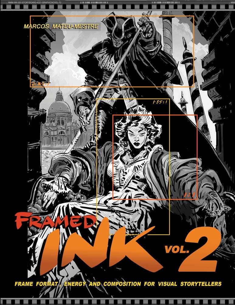
Enter Framed Ink 2, from Marcos Mateu-Mestre.
Framed Ink 2 is Marcos’ fifth or sixth book in his Framed series, which focuses on breaking down visual storytelling for artists.
There are a lot of books out there that can teach a comic book artist a thing or two, but the Framed series has been the most helpful to me of the bunch.
While not specifically tailored to comics (I think the target readership is mostly filmmakers and storyboard artists), the same principles apply, and for me, Marcos’ focus on storytelling just translates better into comicbookspeak than a lot of other books on the market.
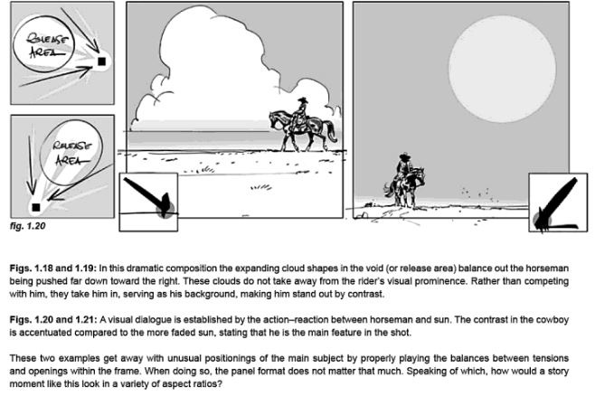
Anyway, Framed Ink 2 focuses on composition, with over 100 pages of breakdowns of different scenes, with detailed explanations about what makes them work, and how to change things around for different formats.
Marcos takes great care to explain things like leaving compositions room to breathe, adding depth clues, and how energy moves around a scene.
There’s a lot in here that will help you if you’re a Webtoon or Instagram comic creator. Marcos covers vertical and 1:1 aspect ratios with every scene, offering critical insights on how to make those compositions work.
There’s also a chapter in the back specifically for comic book artists that does something I haven’t encountered in another book.
Marcos sets up a scene (basically giving you a panel description), and walks you through his process for deciding what points of emphasis matter in the composition.
He shows how you can take a bunch of different approaches to a shot, and make choices to enhance the storytelling of a scene if you have to change the aspect ratio partway through (imagine the situation we’ve all been in where you bump a panel to another page and need to redraw it slightly).
He also made me think about comics in a different way.
I often think of panels and pages as restricting and need to force myself to create space in smaller spaces to make shit work.
But Marcos sees the comic format as a more liberating and flexible medium than any other, since you can use every aspect ratio at once, break elements out of the borders completely, etc.
That’s something only comics can do.
It’s a point I’ve sort of heard before, but something about how Marcos said it just really clicked with me.
Who’s this book for?
This is the perfect book for someone who already knows the basics, like perspective and composition. Someone who can definitely make comic pages, but something about them still isn’t clicking. It’s hard to put your finger on what that is, but you just intuit that something is off.
I can see how Marcos’ style might be frustrating for some. He has a very, “there are no wrong decisions” kind of vibe, offering numerous examples of different ways to make energy and drama work, depending on what you want to focus on.
That can be a little overwhelming. This isn’t a book that says "do this, not that.”
He does do some “hard rule” stuff, explaining concepts like the rule of thirds, and breaking compositions into different formats that offer the kind of rigidity some artists may need to rely on if the “energy flow” stuff just isn’t tracking.
Overall, there’s a lot in here that is really valuable for a second-year artist who doesn’t want to grind their teeth working out these kinks organically over their next 500 pages.
It’s probably one of those books I’ll pick up from time to time when I get stuck or feel like I’m in a rut with something.
And like I mentioned, Marcos has a whole series of books that cover other essentials for a comic book artist, like perspective, lighting, character, etc. I have a bunch of his books, and they helped me more than almost anything else I tried. Track them down, you won’t regret it.


