PROCESS: Organizing Chaos
Look a little closer at chaotic scenes. They are, in-fact, painstakingly composed.
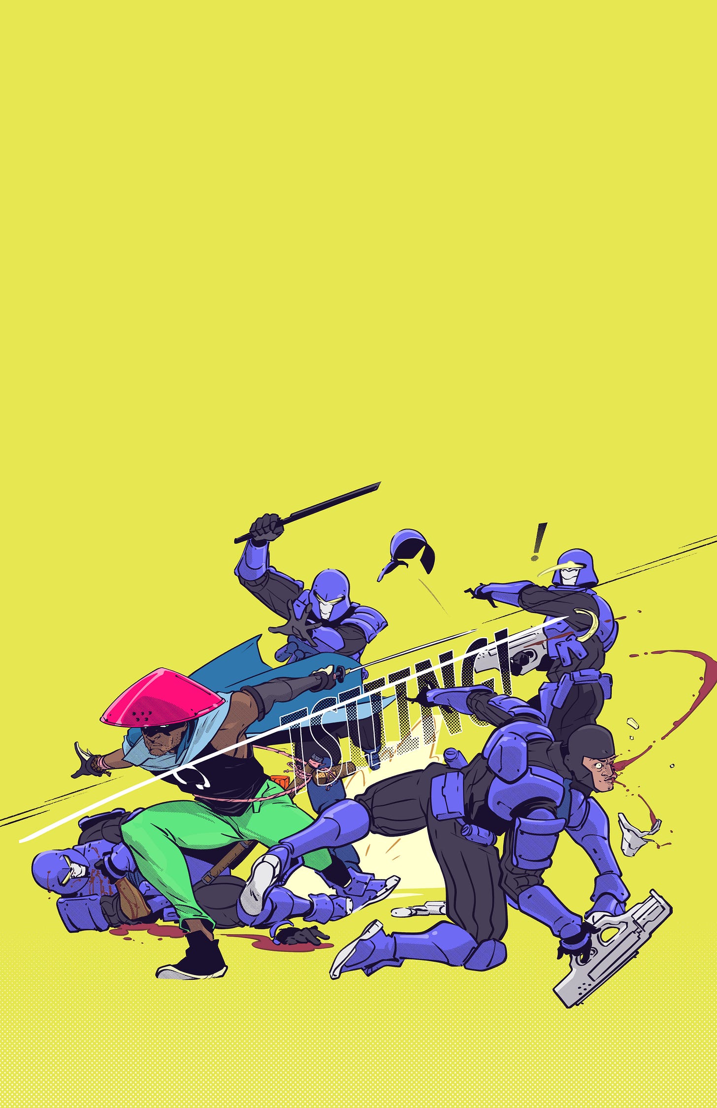
I drew something. Here it is:
This is a teaser for the upcoming relaunch of my webcomic Ronin Digital Express. It’s destined for a life as a cover of some kind, which is why milady has no clothes.
If you like this, the first thing I want you to do is make sure you’re subscribed to Ronin Digital Express.
If you really like this, then stick around for some navel-gazing thoughts about art, and a process breakdown for how I put this together.
Art Talk (the what)
An interesting thing about art is that none of it is an accurate reflection of reality. Not really. And yet, our brains accept art as an accurate reflection of reality. At least in some form.
Example: There’s this mumblecore movie called Drinking Buddies. The first film in this genre I’d seen.
If you don’t know, mumblecore films are pretty understated in presentation. They often use natural lighting, mundane sets and costumes, and actors improvise dialogue. This gives the audience a hyper-real voyeuristic impression.
Mumblecore gives you a messy story that unfolds in the same chaotic, messy ways our human lives do. At least, that’s what mumblecore is designed to make you think it’s doing. More on that in a moment.
The point is, I didn’t really care for the mumblecore genre. But, I was very impressed by how “realistic” Drinking Buddies was when I first saw it.
I put that in quotes because, as I alluded, absolutely nothing about the movie is literally realistic.
The actors are still pretending to be someone else. They’re still coached on the broad contours of what to say and do in each scene. Jake Johnson still stands on tape that someone put on the ground, on purpose, so that he doesn’t accidentally wander in front of Olivia Wilde during the emotional climax.
Oh, and there’s a climax! Where all of the tension that has been slowly boiling over the course of the film comes to a head, and when we reach that point, we all know that the movie is almost over.
Why? Because it’s not real life. It’s a story, and stories follow rhythms.
All the director did was tweak a couple of presentation details — the lighting, the costumes, the improvised dialogue — to give a novel impression of realism. It seems more realistic because you’ve never seen anything quite like it, but all of the fundamentals of plot, direction, and photography remain the same.
So why do our brains accept this as “realistic” when it’s anything but? Why are we fooled into seeing improvised reality where in fact there is anguished, meticulous production?
At least one plausible reason is that art represents an honest account of what the brain has collected. Our brains are computers that organize the potentially infinite chaotic inputs around us into some kind of narrative of continuity that is called our lives.
Think about the stuff you’re actively ignoring right now. Sounds, smells, petty discomforts. If you’re in public, think of all the conversations happening around you. All the colors to look at.
Your brain is filtering most of that crap out so you can focus on whatever you’re up to. Even if that thing you’re doing is simply relaxing in a hammock somewhere.
If we were forced to watch tape of a day in any one of our lives, even if it were an eventful, memorable day, we would still have at least 23 hours of dead air to grind through.
Reality TV shows cut several days of action into an hour-long episode, and half of that is still scripted.
That’s because most of the time, nothing notable happens.
In fact, many hours are spent in total silence: listening to a podcast in a vehicle, or stacking shelves, or folding laundry, or preparing food, or sitting in front of a computer. Not to mention sleeping. You may observe an occasional laugh or a talking to oneself to break the mundanity. The kind of thing that feels natural inside your own head, but looks bizarre on CCTV.
In any case, if you were hired to turn that day into a screenplay, then what needs doing should be obvious to anyone — you have to organize the events of the day into some kind of 90-minute highlight reel that holds the audience’s attention, drives to your big moment that day, and has some kind of climax (or “reason for sitting here for 90 minutes”).
You could do this with a mundane day where one important thing happens. But you’ll have to make some editorial choices. You’ll have to add production.
The result will still be true. But it won’t be, strictly speaking, reality.
Instead, it will be an honest version of what the brain collected and learned that day. A hyper-condensed piece of human experience that a sensemaking machine has already processed for an audience. A dreamlike thing that is not real, but is nonetheless something that we think could plausibly occur in reality.
That’s why Drinking Buddies was impressive to me. It had the vibe of a disjointed, chaotic human day with a big moment at the end. And that was on purpose. For art’s sake.
This is organizing chaos.
And now, a more relevant example where this post is concerned.
If you were watching someone with a ninja sword fight four people in real life, it would be an absolute mess. Difficult to know where to focus, full of awkwardness, and if the swordsman is a pro, over in a flash.
Yet when you’re watching a film scene of the same, or looking at a drawing, it’s easy to know where to look, to follow the sequence of events, and for everything to have a kind of “flow.”
There’s a patina of chaos, but it’s an illusion. Below that is a tightly choreographed ballet.
That’s my intention with combat in Ronin Digital Express, and this print was a test run.
Here’s how I did it. How I organized chaos.
Process Talk (the how)
The first thing I had, of course, was an idea.
I wanted a shot that would make for a good “teaser” poster for Ronin Digital Express. Preferably something that showed action, tension, insurmountable odds, and a chance for the hero to shine.
The two pieces that inspired me most were 1) the cover art for the Chris Claremont/Frank Miller Wolverine series, drawn by Miller:
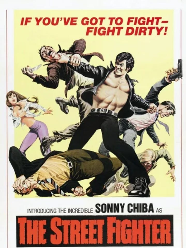
And two, the poster for The Street Fighter, an old Sonny Chiba martial arts flick:
So I settled on a very rough thumb that looked like this:
Our hero is surrounded by bad guys, but his pose suggests strength. Therefore, his triumph is inevitable.
Obviously, matters of depth and motion and character still needed to be worked out. Even the composition, I already understood, isn’t where it’s supposed to be.
But this is an idea. The basic contours of the idea are there.
Next up, turn this into a real-deal illustration.
First thing to do, I am assured, is to come up with a basic shape for the composition.
This is like a visual anchor. A cue for the energy flow of the piece. Where the action is moving to and from. It might be an explosion, with pieces moving in every direction, or it might be like this:
The energy here flows from low-left to upper-right, with a little break at the right third to create an interruption, and thus, some drama.
This might be kind of wooey for the non-artists out there, but stay with me.
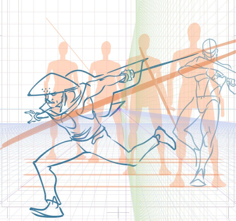
From there, I lay some scale guides and try to work out where each guy is standing. Place a few rulers. (Little pro-tip, you don’t need to follow the guides exactly, but you want to at least have an idea so you don’t do something crazy).
Then I thumb out a few options to get the composition right and fit everything in. The above is a rejected option that I was very close to running with.
I wish I had taken a timelapse of every step I took and every option I rejected so I could show you that. Maybe someday I will. But that would have been very difficult to do, since this took me like 6 hours, maybe even 8, and I didn’t do that in one big stretch.
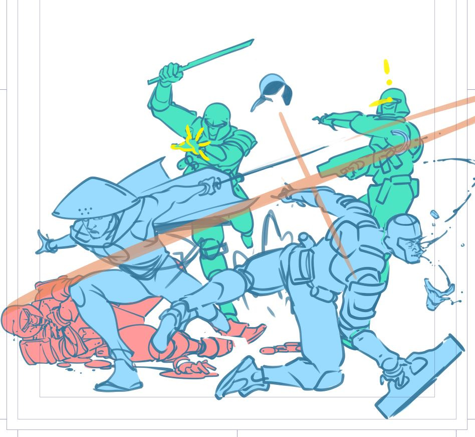
Anyway, at the end of that slog I had this. This is what I’ve been fighting for:
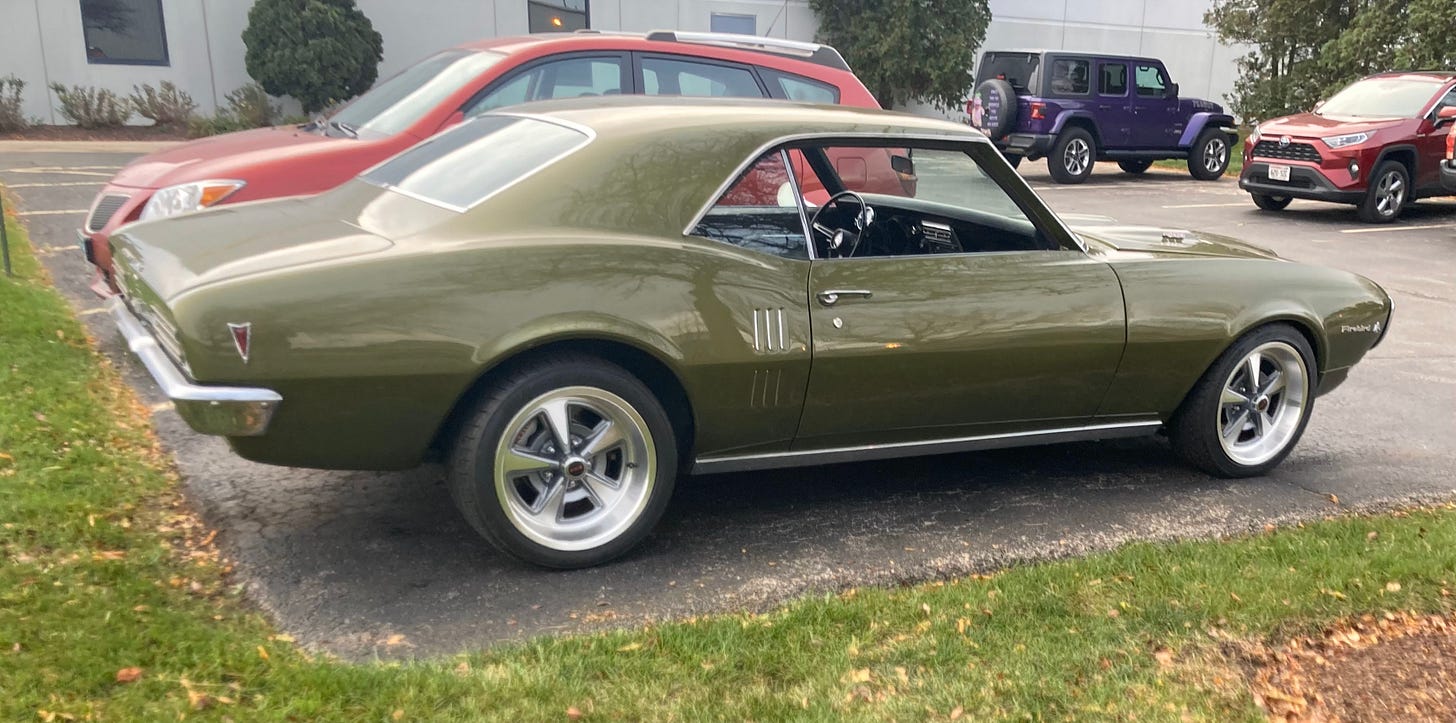
My dad has been rebuilding a classic 1968 Pontiac Firebird for as long as I’ve been alive. But I remember when he turned the corner and was “almost finished.”
“Almost finished,” to my eyes, was a hollowed-out, dusty shell of a car with nothing resembling an interior cabin, let alone an engine.
What I didn’t understand was the foundational work that had been done. The seats, the paint, connecting the engine, the stuff I was looking for, that was all dessert. The fun stuff. That’s not the hill.
That’s where we are here. It looks sloppy, there are even little last-minute edits in bright yellow for me to draw over. Hardly a tight pencil. And yet, here’s where the snowball starts rolling down the hill. I ate my veggies, it’s time for dessert.
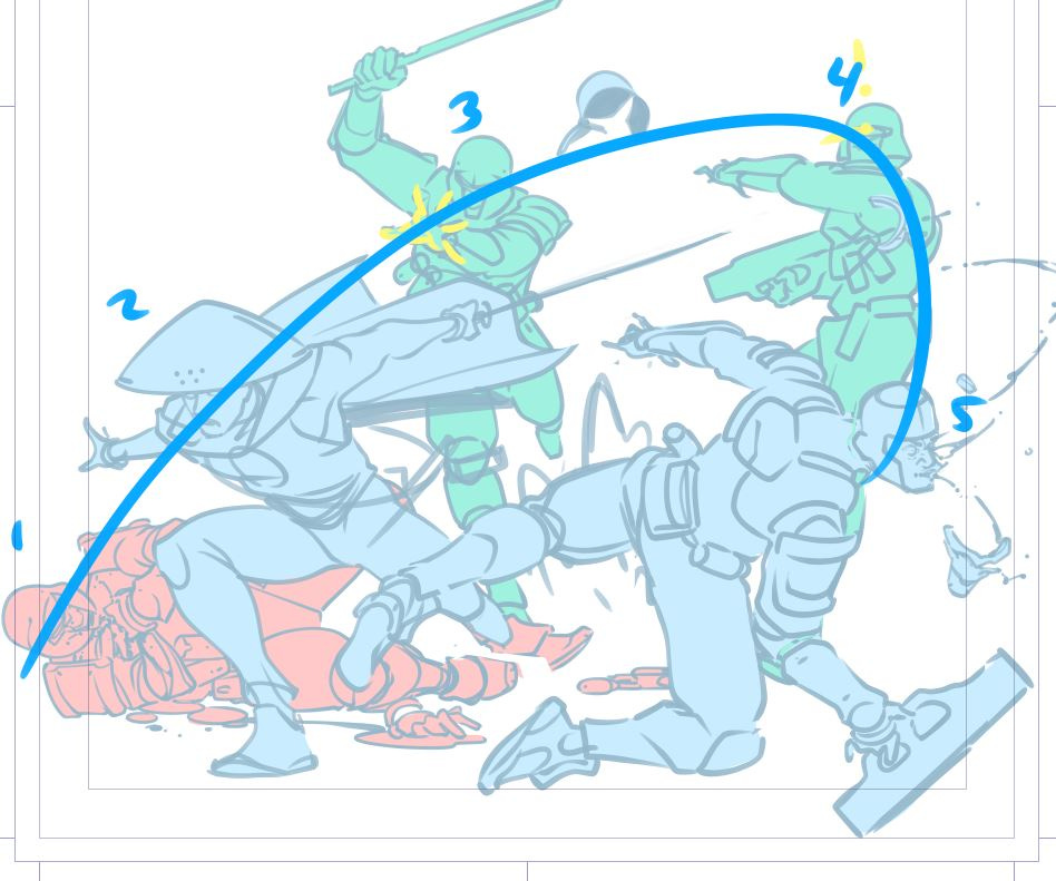
Take a moment to note the way the lines are moving here. If you didn’t get my wooey talk about energy, this’ll show what I mean:
The main composition of the image is following the sword swipe. The entire image starts at the lower left, tight and scrunched, and blows up into dramatic action by the time it gets to the right. So many lines here are purposely directed to point the energy flow in that direction, with a couple following the opposite line, just to break it up and make it feel a little more organic and chaotic (albeit in a tightly controlled way, because again, a lot of the lines here are still following an “X” pattern).
The way your eyes follow the faces is a consideration here as well. Our eyes are naturally attracted to faces, so, how you place those in scene is worth considering. You can see here that they follow an arc. The arc somewhat follows (or hopefully, compliments) the “X” pattern, at least in terms of pushing energy to the right.
It’s worth mentioning that it took quite a bit of nudging these figures by centimeters to line all of this up.
Remember the initial thumbnail — a big part of the concept for me was to have the protagonist surrounded on all sides. And so, I had the machete-wielding baddie further left, and the surprised baddie further right. They sort of framed the protagonist in that composition, forming a bit of a “box” to trap him in.
But this left a pretty big gap in the middle, and it halted the flow of the action from left to right. If I had the protagonist’s energy directing upward somehow, then it might make sense, because all of the lines would be moving upward together.
Different concept, though. Perhaps for another time.
So I nudged the two baddies closer to center and redrew them slightly to orient them in the right direction.
After that, inking, color, and design. Important steps to think through all their own, so maybe we will with another illustration another time. This one’s getting long in the teeth.
A cool car
For anyone who has stuck around this long and is into cars, this is my dad’s ‘68 Firebird.
Be good.
*rent


