The Agony and the Ecstasy (behind the scenes, f*** ups)
No time for me today? Here are the highlights:
Behind the scenes from ep. 3
I don't know if I'd call it a 'process,' but I'll show you it.
How the script fell apart and almost sunk us.
Episode 1.02, "Manners" was published on November 17, 2020. Episode 1.03, "Ronghua"?
... January 27, 2021.
If you guessed that my release strategy was designed to annoy and subsequently lose subscribers, I couldn't blame you.
I've been putting each episode together in real time. I don't have episodes "banked" up. And if I could do it all over again, that's the first thing I would have changed.
But, the train is already in motion, if glacially so.
So what took so long?
Longtime subscribers know that Ronin Digital Express is... basically my first comic ever.
I came into comics with years of practice drawing figures and expressions, because I liked drawing that stuff.
But, page composition, coloring, environments, lettering? I'm learning all of that before your very eyes.
This means sometimes there are fuckups. And this issue of rent*space catalogs some of those ugly behind the scenes fuckups from "Ronghua." The most egregious ones, anyway.
I'll be honest and say I was shocked at the degree to which this thing fell apart.
I mean, I usually get myself into trouble with art. "Draw myself into a corner," literally.
But I've never, ever, had to go all the way back to the script.
I've never had an idea that was fatally flawed at conception.
But as I pulled together thumbs and rough pencils, I spent weeks re-doing key scenes and sequences.
Weeks.
Because the idea was broken.
In what way?
In short, I had a really bad case of "what I pictured in my head makes no fucking sense."
Let's look at an example. First, the perspective for that big establishing shot.
Here, by the way, is the full page, which you can't see on Webtoon (had to crop a lot out):
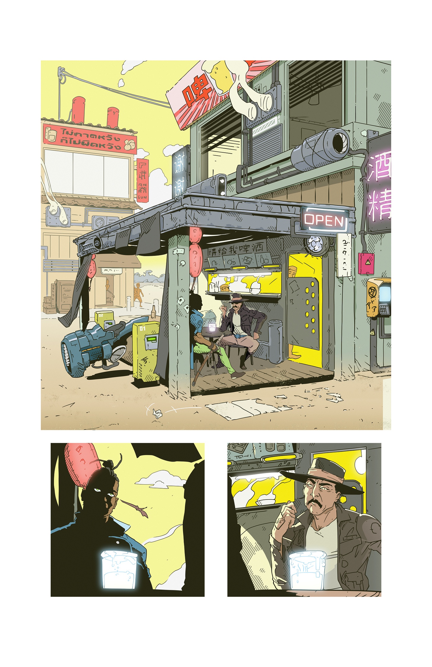
This is probably where I had my biggest bottleneck. I've actually never done a big, two-point establishing shot like this before.
I've played with perspective rulers to draw boxes and such, and understand two-point in theory, but this was a genuine challenge.
Even now I'm not sure it's as "flat" as I pictured it in my head. But I went through a number of iterations trying to get the angle just right:
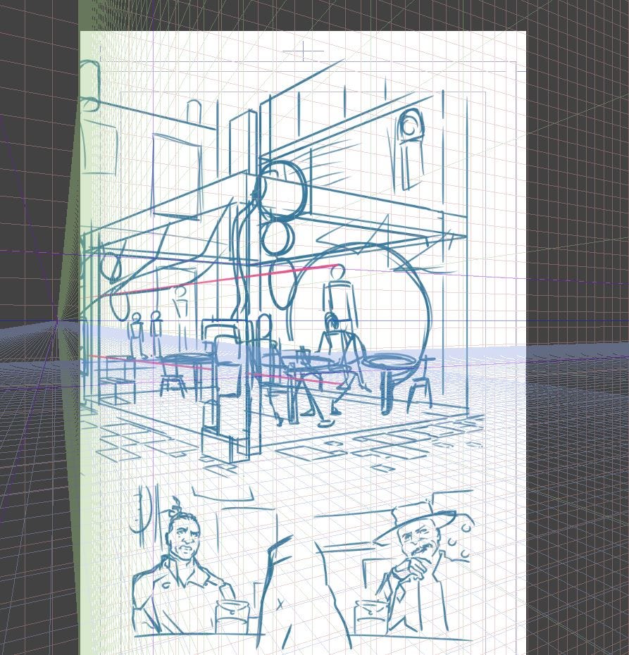
Even now looking back, this one's not so bad.
But at the time, it seemed a little too crowded. I wanted more surroundings. Other buildings, a street, etc.
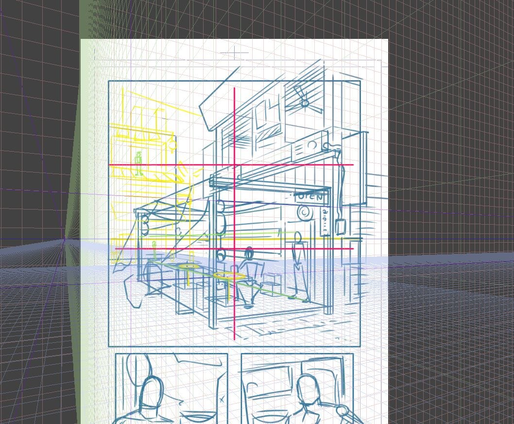
This is a bit more of a dramatic angle than I think I wanted, but it allowed me to squeeze some other stuff in, so here's where I settled.
Part of the problem too was designing the environment on the fly.
As you probably notice from the first example, we had a shorter building, a big, circular entrance instead of a kitchen passover window, a Motokoin kiosk front and center, and no vehicles.
Ultimately what I settled on was a good compromise between space to breathe and little world-building elements I wanted to insert throughout.
World-building elements I had to crop out ultimately anyway :P
We weren't quite done yet, though. I had a number of concepts that were cinematic in my mind, but on paper, looked as though I was trying to draw the comic to be as boring as humanly possible.
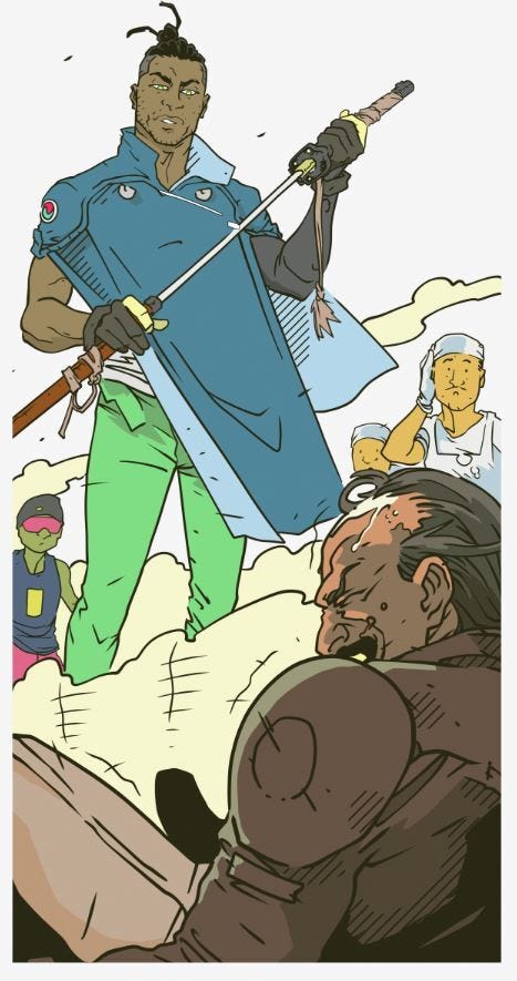
This climactic panel is good. It's dramatic, gives the Green-Eyed Ronin a hero pose, and drops the background out to focus on the figures and the dialogue.
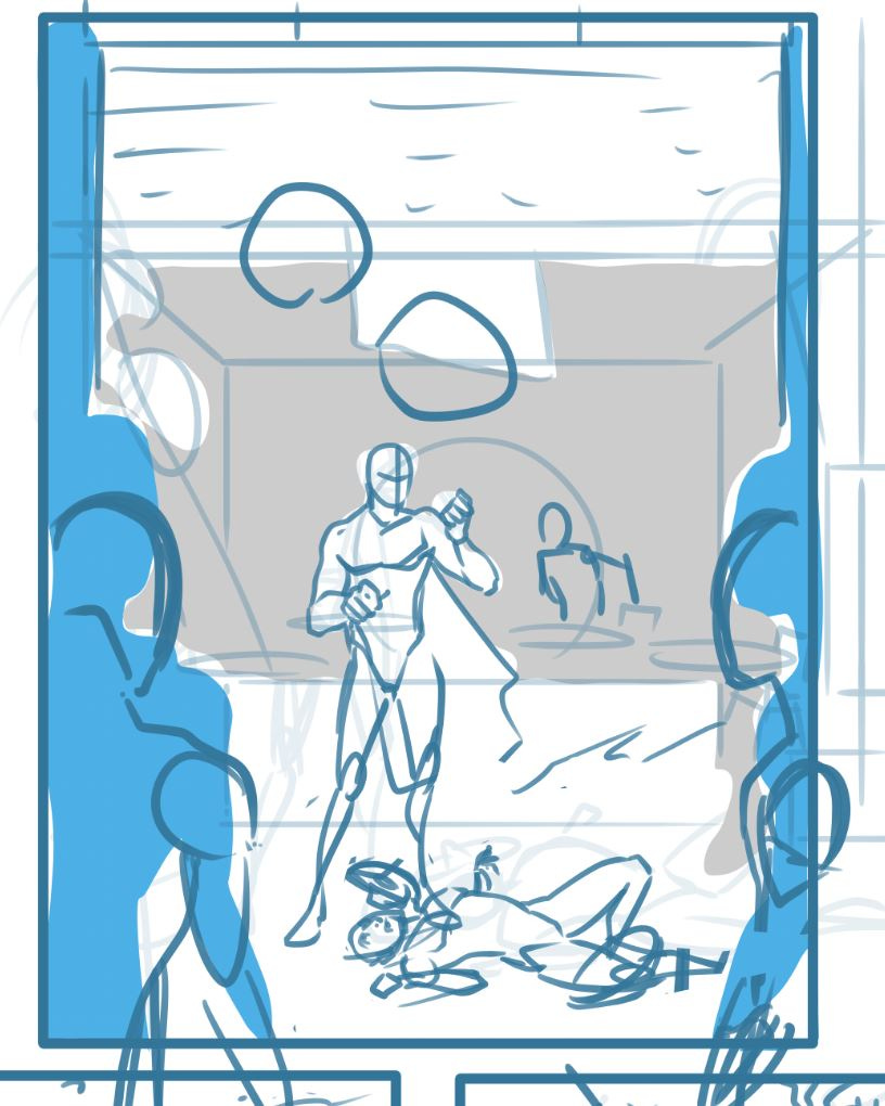
This was my first idea.
The chiaroscuro created by the onlookers isn't too bad, but the flat one-point shot is about the least dramatic way to present the action here.
A long one-shot is better for scenes of isolation or quiet drama, and though that's how I pictured this moment in my head, it really just did not work here.
And what the ever-loving fuck is the villain doing on the ground, there?
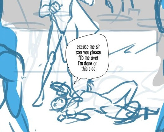
This pose is my attempt to make something seem organic and visceral, but it ends up looking like the figure has an itchy back.
One thing I wanted to/want to do with Ronin Digital Express is to make death as unglamorous, even humiliating, as possible. So to a certain degree, a pose like this makes some sense.
But, what I want out of a reader there is a fear response.
A fear of their own death being humiliating or having no meaning. A fear that no matter how much time you put into your body or a skill, that if you live a violent life, at some point that life is just going to be gone instantly, and there's no way to prepare for it, and little time to reflect on it as your consciousness succumbs to darkness.
So, you know, it kind of defeats the purpose if a reader's impulse is to laugh.
Lessons learned.
This wasn't the only place I ran into trouble. I had a devil of a time getting the look of the villain exactly right.
I wanted him to be doing something mundane in his first appearance. Something casual, and arrogant. Like chewing on a fingernail.
So I drew him...
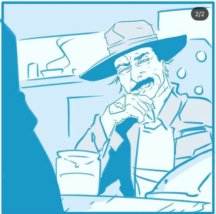
And I drew him...
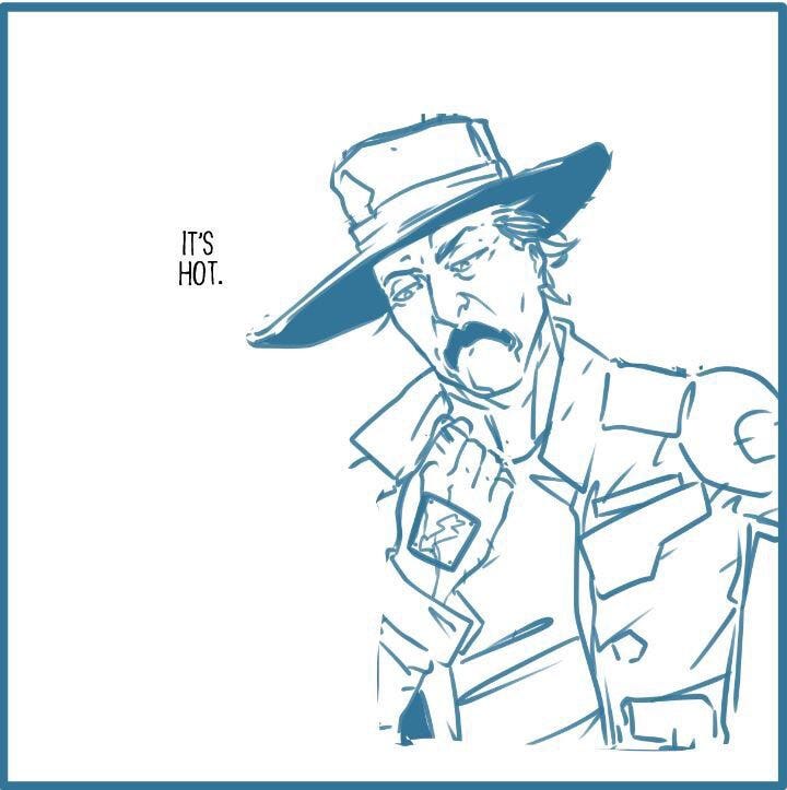
And I drew him...
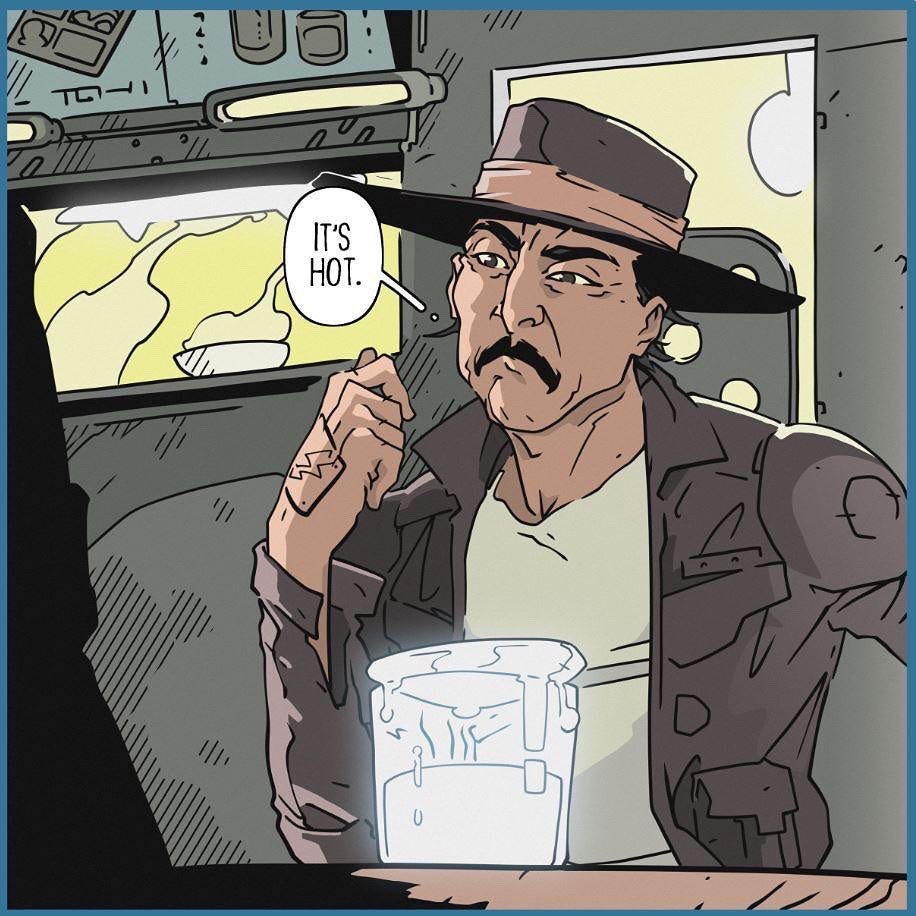
This wasn't the only expression I had to do several times, either.
Here was his original death scene:

I kind of like how sad and pathetic he looks. But I also hate how his head looks like a grapefruit in a sock.
So here's what I settled on:

Hey, let's talk about the villain.
Here's his original design:

I really want to move Ronin Digital Express more in the aesthetic direction of a Spaghetti Western.
It's been a western from the start, but looking back on the first couple of episodes, I don't really think that concept comes through just yet.
The idea with this first handful of episodes is to just do "day in the life" type stories; to get you used to the world and the character before things start taking on more of an arc.
So, I wanted to take the opportunity to pivot into a look and feel that I think will be consistent from here on in.
You'll have to let me know if it's working for you.
But anyway, I thought that a great way to do it would be to have a good old-fashioned western showdown with a good old-fashioned black hat.
Immediately, I pictured Lee Van Cleef from The Good, the Bad, and the Ugly. I did a spin on that Angel Eyes character with Volonte here, whose name is borrowed from another Sergio Leone regular, actor Gian Maria Volonte (he played the villain in both A Fistful of Dollars and For a Few Dollars More, opposite Van Cleef in the latter).
Another thing I wanted to introduce in this episode is the Green-Eyed Ronin's full face.

In the first couple episodes, he is primarily hidden behind his kasa and sunglasses, though you get a peek at his green eyes in a few panels.
That's because I wanted him to seem enigmatic and unknowable to start. Mysterious, like a Man With No Name type. Clint Eastwood, Toshiro Mifune, or Charles Bronson.
But the great thing about that archetype is that it tends to thaw over time. You start to see vulnerability peek through.
This chapter begins a planned transition into a more vulnerable protagonist, and a big twist coming a few episodes from now.
Anyway.
You'll notice that I ultimately hid his face in shadows anyway in the final version, but there are still a lot more opportunities to get a good look at him here than ever before.
Speaking of, here's the full splash page from the climax that I had to crop for Webtoon:
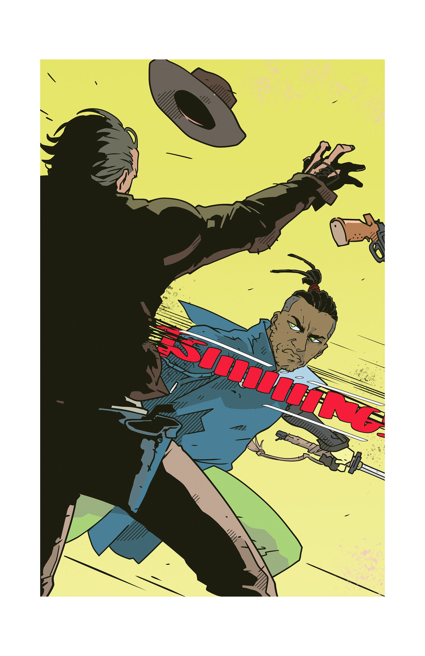
This page wasn't even in the script. I was going to try and squeeze it into a 4-panel page.
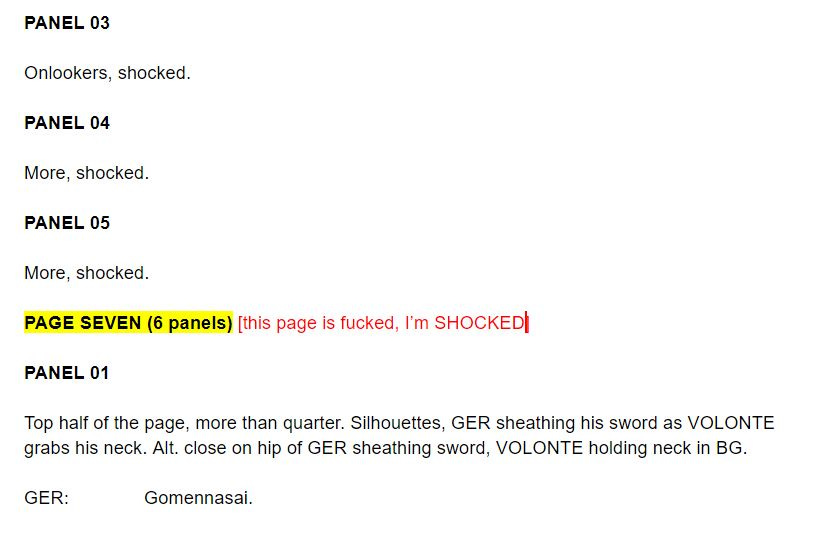
You can see how that turned out below. The yellow and red denote two separate rounds of edits/notes made in real-time that I wasn't confident enough to actually commit to.
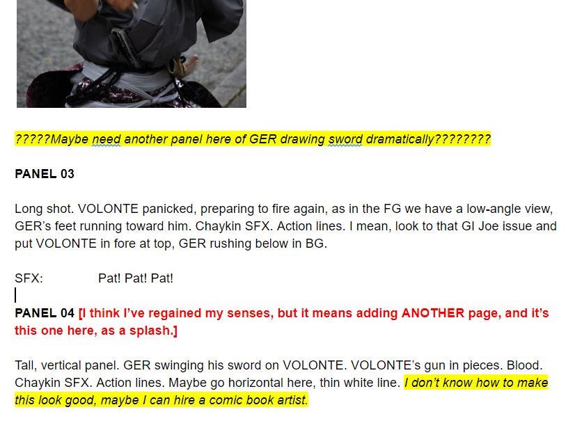
It's not that unusual for my scripts to contain notes that really only make sense to me. Since I'm also the artist, I can get away with vague references like "that GI Joe issue".
Point is, I wouldn't take any pointers from me on scripting.
This script is a unique nightmare, though. Even for me. It will forever remain a work in progress, with so many notes scribbled in the margins, partial rewrites, and self-deprecating mockery that I've condemned it as effectively unreadable.
Overall, I'm pretty happy with how this episode turned out, its myriad production problems notwithstanding.
I'm hoping that the lessons learned will help me pick up the pace a bit more. Though I'm proud of the first two episodes, the story as mostly been kicking tires up to this point.
Now, things are about to start getting interesting.
If I haven't heard back from you on this issue, please do let me know what you thought of it. You can tell me online or just reply to this email.
If you haven't read it yet, do so here. Leave a comment or like if you can, it helps a lot.
That's all for now.
Thank you for your support. It really means a lot.
Be good.
*rent


